


Introduction and unboxing
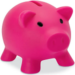
Minimalism meets functionality, all in one block. The Block keyboard is based on a deliberately minimalist design that combines suitability for everyday use with a clear design language. The soft gray tone of the housing, complemented by warm orange accents, creates a calm visual presence that blends harmoniously into different working environments. The block-shaped keycaps and the compact 98-key layout are aimed at users who value structured typing and an uncluttered interface.
The keyboard combines classic minimalism with practical features such as long battery life, two retro-style rotary controls and a small display for connection mode and battery status. The PBT material provides a matte, durable surface, while the gasket-mount construction creates a comfortable and balanced typing experience. With Bluetooth, wireless mode and USB-C, a wide range of connectivity options are available, compatible with MacOS, Windows and Android.
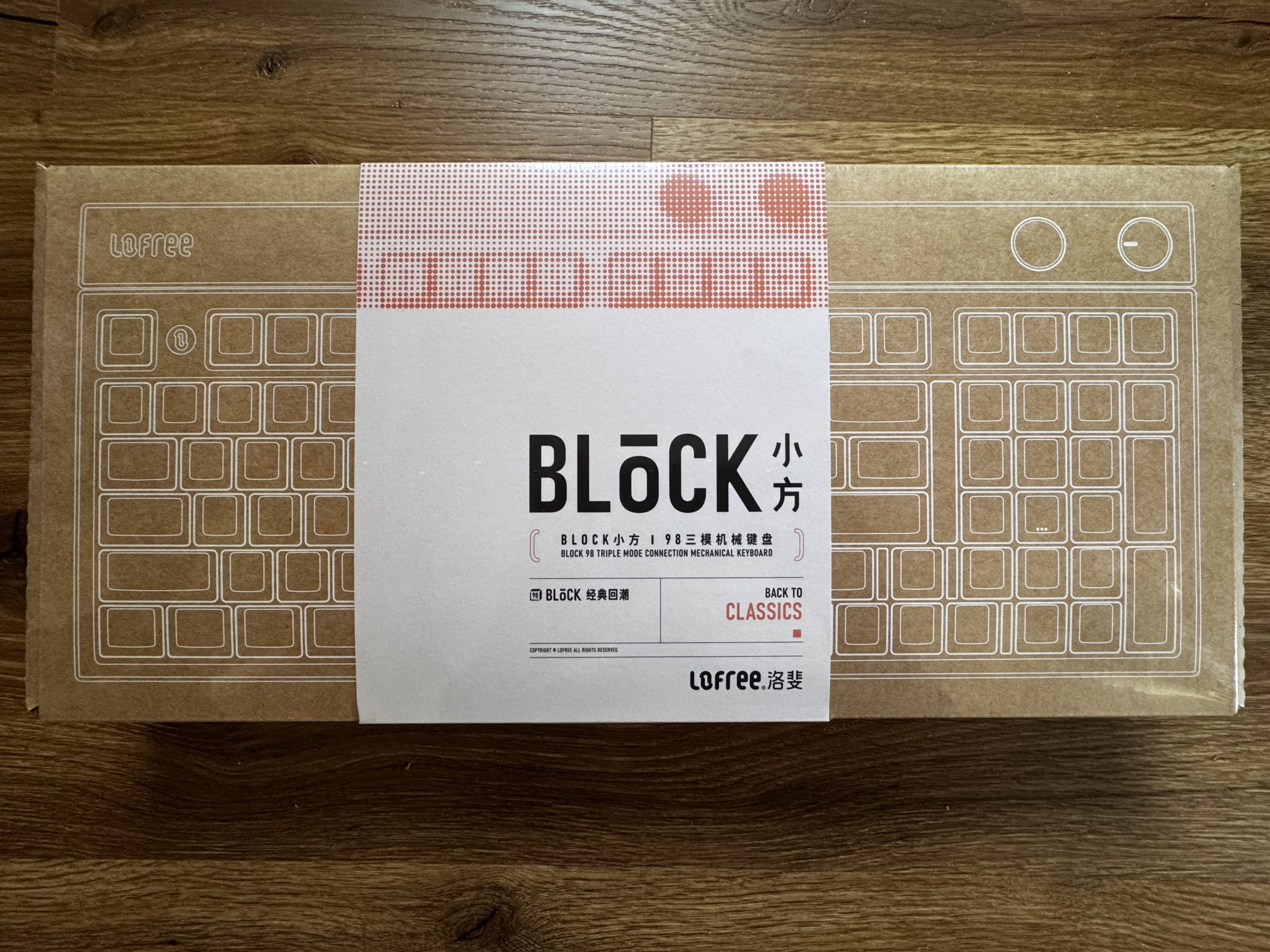
The front of the packaging is also made of brown cardboard with a white line graphic. A white band with red graphic elements and the Block lettering surrounds the cardboard and gives the design a clear, classic look.
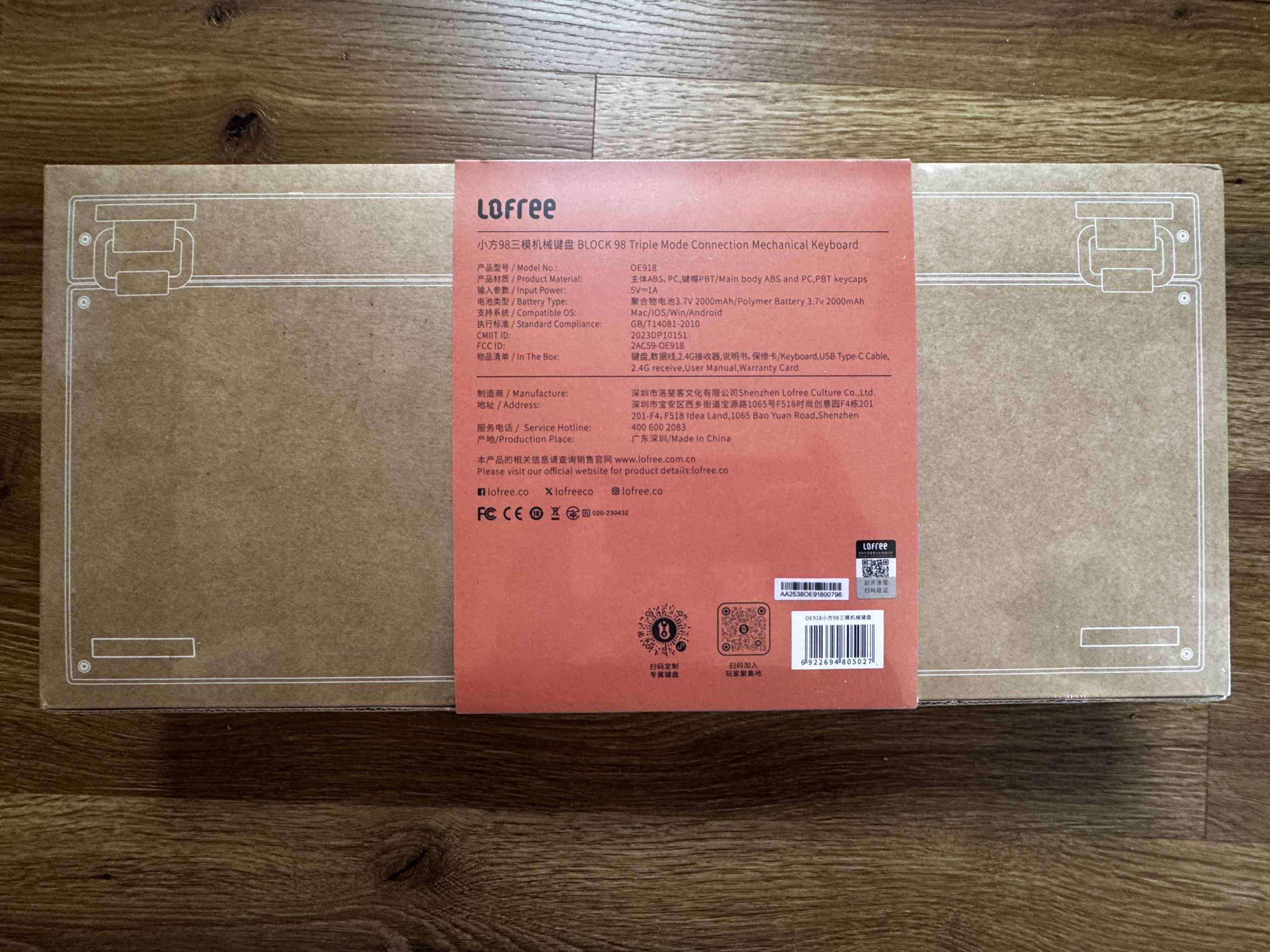
The back of the packaging shows a brown cardboard box with fine white lines that schematically represent the keyboard. In the middle is a red sticker with technical details, manufacturer information and the scope of delivery.
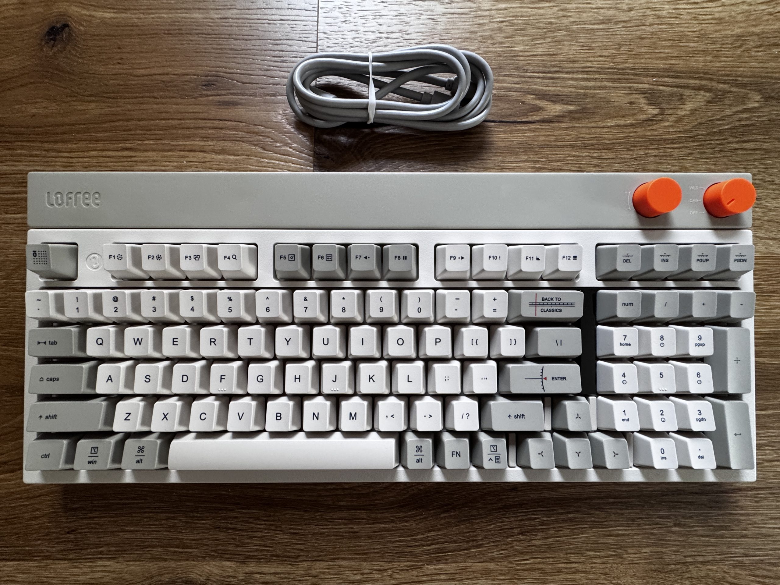
The top shows the complete layout with 98 keys in various shades of gray, creating a calm, clear overall impression. The main keys are kept light, while certain functional areas are accentuated slightly darker. The two orange rotary knobs on the top right edge are striking, deliberately breaking up the minimalist color scheme and offering a retro-style user interface. The Lofree logo is embedded in the top left, and a neatly rolled-up USB-C cable is located above the keyboard. The overall impression is structured, tidy and visually reminiscent of classic input devices from past decades.
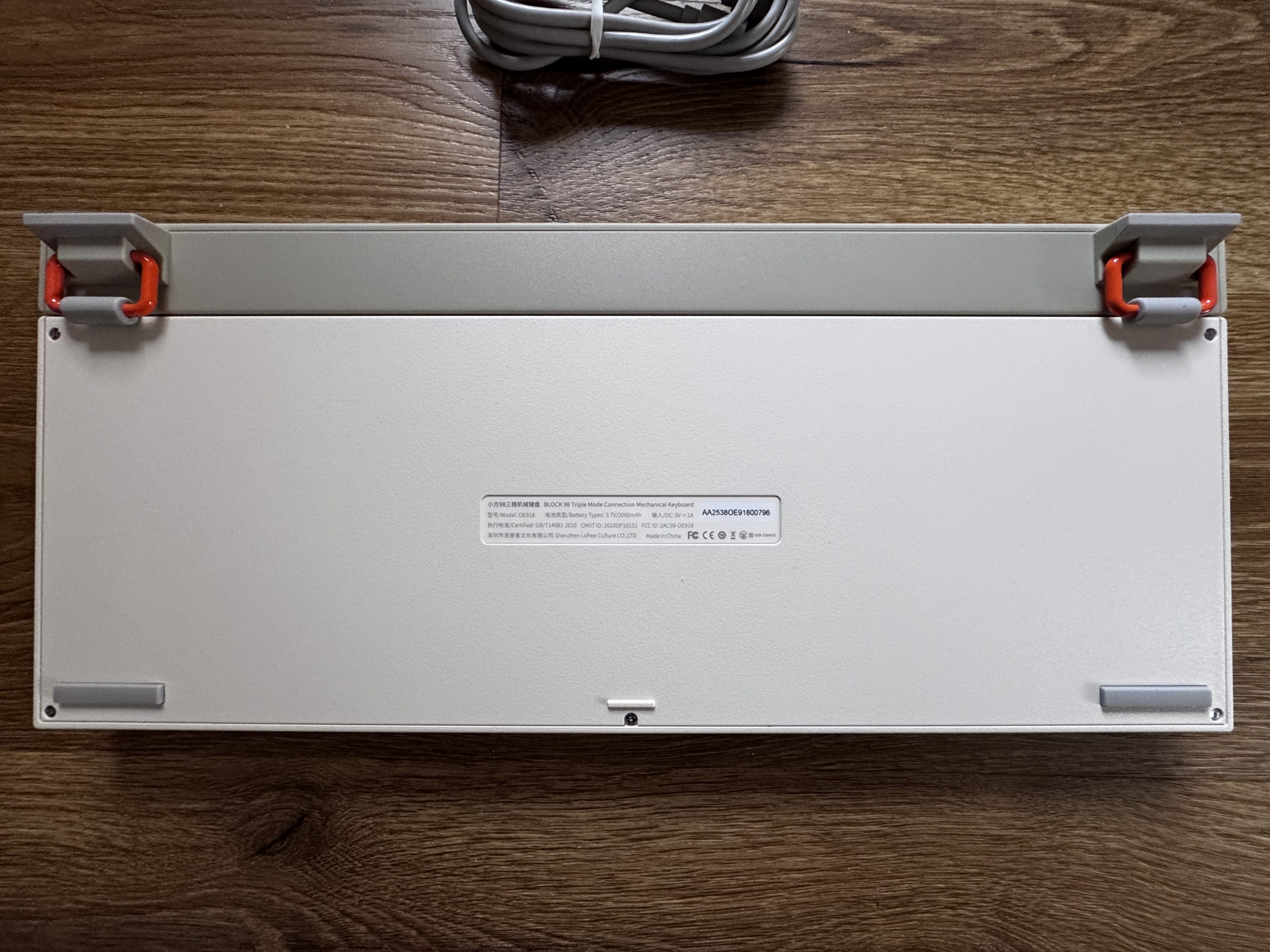
The underside of the keyboard has a bright, matt plastic casing with a slightly textured surface. Two fold-out feet on the top edge create a clear accent, as they are in gray and attached with striking orange joints. This construction provides stability and gives the design a functional, slightly industrial character. There is a narrow sticker in the middle with the model name, certifications and manufacturer information. There are flat rubber pads at the four corners, which are designed for a secure stand and non-slip use on the table.
Personally, I really like this keyboard. I would have liked the casing to be made of metal, as this material often has a higher quality feel and conveys an even more solid feel. Nevertheless, I am much more impressed with the overall design than I had initially expected. The classic style with the restrained old colors is pleasantly unobtrusive and brings a kind of retro charm that is rarely found today.
The overall appearance stands out noticeably from many modern keyboards, which often appear either too colorful or too technical. The result is a calm, clear look that goes well with a wide variety of setups and still has its own identity. For me, it’s simply something different, and that’s exactly what makes the keyboard interesting and appealing.


10 Antworten
Kommentar
Lade neue Kommentare
Urgestein
Veteran
1
Veteran
Urgestein
Veteran
Urgestein
Urgestein
Moderator
Veteran
Alle Kommentare lesen unter igor´sLAB Community →